반응형
streamlit은 회사 내부용 대시보드로 주로 사용하기 때문에
대시보드를 예쁘게 꾸미는 과정 중에 이번에는 다른 기능들을 사용하지 않고 위젯만을 이용해보자
1. streamlit 실행하기
가상환경에 들어가서 streamlit 을 실행해주고 새 파일을 만들어 import 시켜주자
2. 위젯 실행하기
위젯을 만들기 위한 하나의 주제를 잡고 함수를 선언해주자
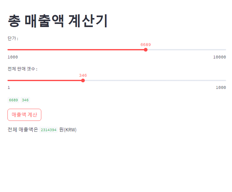
수업에서 사용한 예제를 설명하자면, 단가에 따른 전체 판매 갯수의 총 매출액 계산을 하는 것을 만들어 보았다.
이 때, 주의해야할 부분은 메인 함수를 만 들고 그안에서 새로 만들었던 함수를 실행하는 코드를 작성해야 한다.
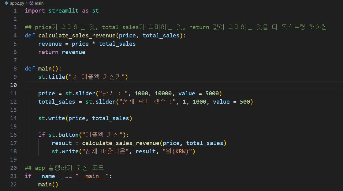
import streamlit as st

## price가 의미하는 것, total_sales가 의미하는 것, return 값이 의미하는 것을 다 독스트링 해야함
def calculate_sales_revenue(price, total_sales):
    revenue = price * total_sales
    return revenue

def main():
    st.title("총 매출액 계산기")

    price = st.slider("단가 : ", 1000, 10000, value = 5000)
    total_sales = st.slider("전체 판매 갯수 :", 1, 1000, value = 500)

    st.write(price, total_sales)

    if st.button("매출액 계산"):
        result = calculate_sales_revenue(price, total_sales)
        st.write("전체 매출액은", result, "원(KRW)")

## app 실행하기 위한 코드
if __name__ == "__main__":
    main()
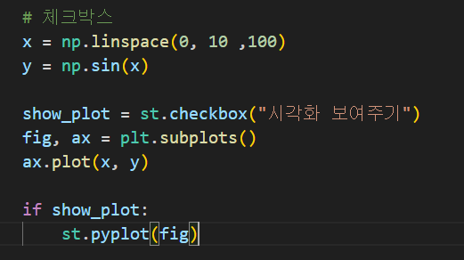
3. 체크박스 만들기
위에 만든 것들을 바탕으로 시각화해 그래프로 나타내보자

4. 3가지 산점도 시각화
산점도를 사용하는 프로그램에 따라 보여주는 코드를 만들어보자
먼저 결과부터 보여주면 다음과 같다.

아래의 코드는 main함수 앞에 붙였다.
# 산점도 코드
def plot_matplotlib():
    st.title('산점도 matplotlib')
    fig, ax = plt.subplots()
    ax.scatter(iris['sepal_length'], iris['sepal_width'])
    st.pyplot(fig)


# 산점도 코드
def plot_seaborn():
    st.title('산점도 seaborn')
    fig, ax = plt.subplots()
    sns.scatterplot(iris, x = 'sepal_length', y = 'sepal_width')
    st.pyplot(fig)


# 산점도 코드
def plot_plotly():
    st.title('Scatter Plot with Plotly')
    fig = go.Figure()
    fig.add_trace(
        go.Scatter(x = iris['sepal_length'],
                   y = iris['sepal_width'],
                   mode='markers')
    )
    st.plotly_chart(fig)
그리고 앱 실행코드 바로 위에 이 코드를 작성한다.
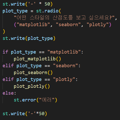
st.write('-' * 50)
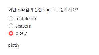
plot_type = st.radio(
"어떤 스타일의 산점도를 보고 싶으세요?",
("matplotlib", "seaborn", "plotly")
)
st.write(plot_type)
if plot_type == "matplotlib":
plot_matplotlib()
elif plot_type == "seaborn":
plot_seaborn()
elif plot_type == "plotly":
plot_plotly()
else:
st.error("에러")
5. select box
select box를 활용하는 방법과 복수 선택을 하는 것을 함께 작성했다.
# selectbox
st.markdown("## Raw Data")
st.dataframe(iris)
st.markdown("<hr>", unsafe_allow_html=True)
st.markdown("### Selectbox")
st.write(iris['species'].unique())
col_name = st.selectbox('1개의 종을 선택하세요!', iris['species'].unique())
st.write(col_name)
result = iris.loc[iris['species'] == col_name].reset_index(drop = True)
# st.dataframe(result)
st.title('Scatter Plot with Plotly')
fig = go.Figure()
fig.add_trace(
go.Scatter(x = result['sepal_length'], y = iris['sepal_width'],
mode='markers')
)
st.plotly_chart(fig)
st.title('Scatter Plot with seaborn')
fig, ax = plt.subplots()
sns.scatterplot(result, x = 'sepal_length', y = 'sepal_width')
st.pyplot(fig)
st.title('Scatter Plot with matplotlib')
fig, ax = plt.subplots()
ax.scatter(result['sepal_length'], result['sepal_width'])
st.pyplot(fig)
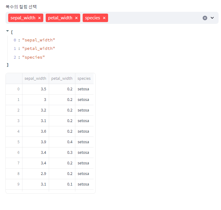
#MultiSelect
cols = st.multiselect("복수의 컬럼 선택", iris.columns)
st.write(cols)
filterd_iris = iris.loc[:, cols]
st.dataframe(filterd_iris)
그러면 다음과 같이 열을 선택할 수 있게 된다.
반응형
'데이터' 카테고리의 다른 글
| 가상환경 jupyter lab을 이용해 selenium 세팅하기 (Python) (0) | 2023.08.01 |
|---|---|
| Django로 회원가입/로그인 페이지 만들기 (Python) - 1탄 (0) | 2023.07.31 |
| streamlit 꾸미기를 해보자 - seaborn X matplotlib 활용편 (0) | 2023.07.28 |
| streamlit 꾸미기를 해보자 - 데이터 프레임 활용편 (0) | 2023.07.28 |
| streamlit 꾸미기를 해보자 - 마크다운 활용편 (0) | 2023.07.28 |


